As a SaaS user, you can probably point to companies who provide you with the best user experience. You know it when you see it, right?
But, how do you create an awesome UX for your SaaS customers? We decided to go straight to the experts at InVision and ask them what accounts for a great SaaS UX.
Here are the 7 principles they identified as must-haves:
- Frictionless signups
- Laser focus on your target audience
- Simple onboarding
- Very easy-to-use UI
- Personable
- Beautiful design
- Support is readily available
SaaS UX Must-Have Principle #1: Frictionless signups
Common ways to remove friction during the signup process include:
- Removing credit card information as a signup requirement
- Using short signup forms
- Using a clear Call To Action (CTA)
- Making the signup workflow very simple
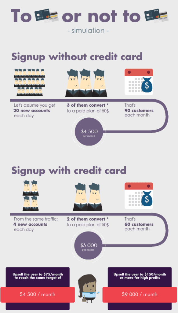
Don’t require credit cards for trial signup.
In Totango’s benchmark SaaS study, trial signups and conversions were less successful when people were required to provide credit card information during the signup process:
Use short signup forms.
It can be tempting to ask for as much user information up front as possible. Don’t. Only ask for the information you absolutely need.
If you have optional form fields on your signup form, consider removing those because the user may only see a longer form without realizing some of the requested information is optional.
As Murphy points out above, you can ask for additional information later.
Have a clear CTA for signup.
Is “submit” the CTA on your form’s submit button? Rethink the wording there. Consider using the CTA on the submit button to explain what will happen after the button is pressed.
For some, submitting a form without a clear understanding of what happens next causes uncertainty. Uncertainty can cause friction.
You can use A/B testing to determine the best CTA for your signup. Via A/B testing, one company “increased revenue by $330,000” when they changed their free trial CTA from “Get a free trial” to “Start free trial.”
Make the signup workflow simple.
All three of the points above are part of creating a simple, frictionless signup workflow. You should also consider how many steps a user must move through in order to signup.
InVision is a great example. On their home page, the signup CTA is front and center:
GET STARTED — FREE FOREVER!
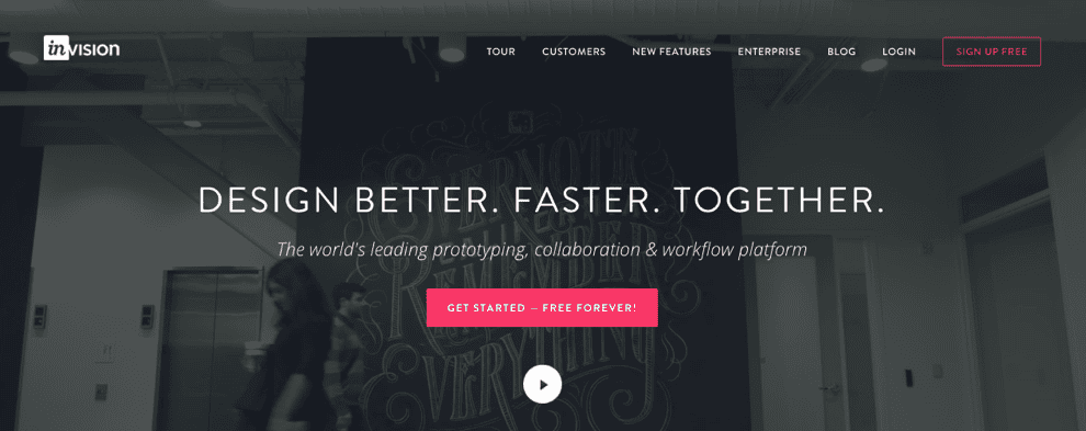
The CTA not only tells what will happen next, but also addresses a frequent user concern: “How much is this going to cost me?”
Once the button on the home page is clicked, the next page is a signup form which only requires the information absolutely necessary to get a new user started:
The CTA on this page is also simple but clear: SIGN UP FREE
SaaS UX Must-Have Principle #2: Laser focus on your target audience
The key to accomplishing great SaaS UX is to have a laser focus on your target audience. Conducting usability testing with all of your primary personas is incredibly important. Ensuring that your product voice and tone are appropriate for your audience makes an huge impact as well.
Jennifer Aldrich, UX & Content Strategist at InVision
Aldrich points to Spotify as a company leading the way in SaaS UX. As such, they’re uber focused on their target audience: millennials.
“Lots of companies are targeting this audience, but for us, it’s unique. Our founders are millennials, our audience are millennials. We listen to them, we talk to them, we interact with them for hours every day,” says Alexandra Tanguay, Global Brand Director at Spotify.
The social aspects of being able to connect with friends, follow friends’ playlists, and create playlists for friends to follow all resonate with the millennial audience. They crave connection.
Spotify has created a user experience focused on the curation and discovery of new music; it’s an experience that resonates with millennials. Spotify’s UX isn’t just tactical — it stands out amongst competitors who have positioned themselves as simply a platform for listening to music.
SaaS UX Must-Have Principle #3: Keep onboarding simple
If a user can accomplish what they need inside a product without crazy onboarding flows, tutorials, or user-training, your users will be satisfied.
Connor Murphy, Designer at InVision
Take “special care to create an excellent onboarding experience,” adds Aldrich.
Both point to Slack as the consummate example of great SaaS UX, particularly in the area of onboarding.
Samuel Hulick did a Slack onboarding teardown and mapped out the onboard flow:
Even for new users who are tasked with setting up their entire company on Slack, onboarding is simple…and fun! A new user can join Slack, start a team, create channels, setup integrations, and onboard other team members in about 20 minutes.
Slack even has a concise, easy-to-follow onboarding checklist that walks you through each step of that process, and playfully ends with:
Many credit Slack’s awesome onboarding as one of the key elements that contributed to the company earning unicorn status less than a year after launch.
SaaS UX Must-Have Principle #4: Make the UI very easy to use
What makes for great SaaS UX is when it doesn’t feel like you’re using a SaaS product. Generally with SaaS products being so large and complex, interfaces tend to get overly complicated and the user gets lost in the mix when teams try to integrate new features. The best SaaS products are as enjoyable to use as your favorite consumer facing products.
Scott Savarie, Lead Designer at InVision
The InVision designers we spoke to agreed Quip and Campaign Monitor stand out as leaders for easy-to-use user interfaces. Campaign Monitor’s drag-and-drop email editor allows marketers to create and design beautiful HTML emails quickly and easily.
The technical complexities are hidden behind a clear and simple UI, seen in the above screenshot.
Productivity platform Quip has long been praised for its simple, easy-to-use UI, but a recent revamp has users cheering:
New @quip UI is pure candy –– Loving it.
— naveen.com (@naveen) February 7, 2017
After being acquired by Salesforce last year, some of the new updates allow Salesforce data to be exported directly into Quip spreadsheets. The Quip UI updates also include ‘contextual menus’ that adapt to the activities the user is doing in their documents or worksheets.
According to Quip CEO Bret Taylor, “the new features and design allow for a level of collaboration, that without Quip, probably would’ve taken three email threads and a file attachment.”
SaaS UX Must-Have Principle #5: Be personable
Leverage personality in your app. Personable language makes users feel like they are connecting with real people.
Connor Murphy, Designer at InVision
Again, they point to Slack as the winner here. If you’re one of the millions of Slack users, you probably agree. Slack is personable and fun. It makes you smile. Sometimes it even makes you laugh out loud!
“With Slack, a bubbly, bright UI, delightful interactions, and hilarious copywriting come together to create a personality,” explains Andrew Wilkinson, founder of MetaLab. MetaLab is the company Slack hired to turn their initial prototype into a polished product.
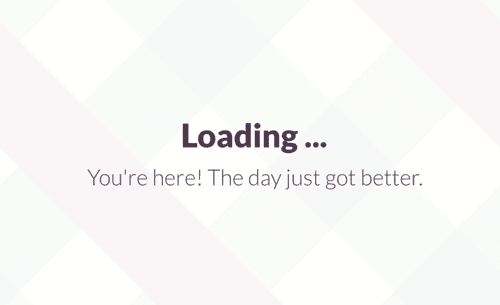
Where competitors may just show a loading spinner, Slack takes the opportunity to welcome the user in a fun way. “In Slack, every piece of copy is seen as an opportunity to be playful,” says Wilkinson.
Slack’s personable copy doesn’t stop in-app. Everything from their support tweets to documentation to app fixes copy are helpful, witty, and fun. Here’s an example of Slack’s copywriting for Mac app fixes:
Just be sure your tone is appropriate for your brand and audience, Aldrich reminds us.
SaaS UX Must-Have Principle #6: Beautiful design matters
Make your app beautiful. Gone are the days where visual design doesn’t matter. Look at companies like Dropbox, Asana, Airbnb, Trello… all of these companies have very well designed products.
Connor Murphy, Designer at InVision
Beautiful design can direct a user’s experience. For instance, Asana self-describes their design aesthetic as “calming with pops of energy” and it is designed to give the user a feeling of “calm and focus.”
At the beginning of 2017, Dropbox announced a redesign (along with a launch of several new products). According to Dropbox, “the new interface helps users stay focused on the task at hand while easily accessing related content, and makes the separation between personal and work accounts clearer.”
Beautiful design doesn’t have to be complicated. Dropbox’s web app redesign is very clean and minimalistic:
In the three column format:
- The left column is the main navigation
- The middle column displays your actual files
- The right column shows all the tools you need to start using Dropbox
Clearly, design matters. Make yours beautiful.
SaaS UX Must-Have Principle #7: Help is easily available
Making sufficient product documentation and other help assets readily available will also keep your customers coming back for more.
Jennifer Aldrich, UX & Content Strategist at InVision
Ideally, if your SaaS has the other elements listed in this post, your users will enjoy an uncomplicated and intuitive user experience which doesn’t often require the need for assistance. But, when that need arises, make sure help is easily available.
InVision combines beautiful design and ease-of-use with their readily available help assets:
Notice the “All Systems Operational” in the top right of the screenshot, above. We love this clear, visual way of constantly communicating the systems status to users.
Self-service support options are particularly important for SaaS companies targeting millennial users. Why? Millennials want fast, efficient support without having to contact your company by chat, email, or phone. A study by Aspect Software found 69% of millennials “feel good about themselves and the company they are doing business with when they resolve a problem without talking to customer service.”
Best practices dictate your SaaS also provide additional support contacts for users who prefer to ask questions to your support team or who were unable to find the answer to their question in the self-service support resources. At Maxio, in addition to our robust and up-to-date support documents users can contact support via email, phone, or in-app live chat. Live chat is a popular support option for many SaaS companies, both in-app and on their websites.
Wrap-up
There you have it . . . the 7 must-have principles for a great SaaS UX. A big thank you to InVision’s Connor Murphy, Jennifer Aldrich, and Scott Savarie for taking the time to share their expertise!
Now it’s your turn: is there anything you would add to the list of things needed for a great SaaS UX? Let us know in the comments below. We always enjoy hearing from our readers.
