The first thing I think of when I see a headline about improving free trial conversions is “more money!” And I don’t think I’m alone.
With roughly 75% of SaaS companies offering a free trial, it is no wonder the free trial has become the de facto industry standard.
While conversion rates vary from B2B vs. B2C, SMB vs. Enterprise, etc., a study by SaaS industry research firm, Softletter, indicated that 66% of online companies surveyed had free-trial-to-paying-customer conversion rates of 25% or less.
With that said, free-trial-to-paying-customer conversion rate is not the only metric to consider – but it is an extremely important one! Let’s look at two scenarios, assuming your average revenue per user is $100/month:
- 40% Conversion Rate: You have 40 conversions out of 100 free trials. Your conversion rate is 40% (wow!) and revenue increases by $4,000/month.
- 20% Conversion Rate (for the win): You have 60 conversion out of 300 free trials. Your conversion rate is 20% and revenue increases by $6,000/month (double wow!).
Which would you rather have? Personally, I’d take the 20% conversion rate (over 40%) that provides an additional $2,000/month in revenue AND provides a larger pool of potential paying customers that could be nudged towards a purchase decision.
The takeaway? The value of free trial conversions can sometimes be more important than the free trial conversion rate alone, and you should track and constantly strive to improve both metrics.
In this post, we will cover the top 5 tips to improve free trial conversions and increase revenue:
- Reduce friction
- Improve onboarding (yes, we’ve covered this in previous posts, but it is so important for SaaS success!)
- Send action based communication
- Design your upgrade workflow for conversion success
- Create an end of trial feedback loop
Your trial users aren’t going to convert themselves! Let’s get started…
#1 Remove friction

The great credit card vs. no credit card debate
While it is common for SaaS companies to differentiate the “tire kickers” from trialers more likely to buy by requiring credit card details as part of the trial setup, Totango reported this practice results in lower signup conversion rates.
Data from Totango’s benchmark SaaS study revealed trial signups and trial conversions were more successful when trial users were not asked for credit card information during the signup process.
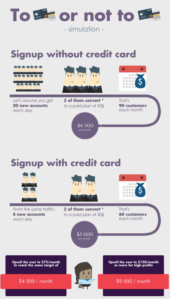
It is important to note the way in which those details are asked for can be key to an increased success in signups.
For example, CrazyEgg requests credit card details at trial signup. After seeing low signups the company wondered if visitors were scared they would be automatically billed. Rather than completely remove the credit card requirement, they tested an alternate signup page with an explanation specifying that prospects would not be billed automatically. The A/B tests resulted in a 116% increase in trial signups for the page with the explanation.
Condensed sign up forms
Signup forms themselves can be a friction point for trial users. Kissmetrics analyzed the highest converting websites and found the majority used short signup forms.
Companies have a tendency to extend trial signup forms in order to squeeze in as many qualifying questions as possible. While this practice helps identify prospects who are more likely to purchase, it could also hinder signup conversion rates. You certainly want to take advantage of the opportunity to receive qualifying information from your users, but those questions don’t necessarily need to happen on the initial signup form.
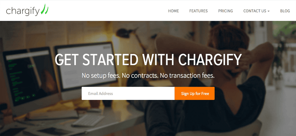
At Maxio, we’ve purposely made our free signup incredibly simple (above). Additional qualifying information is requested later. Our friends over at Appcues follow a similar workflow, making it super simple to sign up, and then they ask additional questions (below) once the trial signup is successful.

“Think about it this way: every additional field makes you lose a number of prospects. Is the additional information you gain from the field WORTH losing those people?,” questions Peep Laja, founder of ConversionXL.
Additionally, consider getting rid of optional fields or at least A/B test a version of your signup form without the optional fields. An eyetracking study found that prospects don’t always differentiate between required and optional fields, so they may not realize they’re only required to fill out a portion of a longer, more overwhelming form.

If optional fields are preferred, deviate from the old asterix (*) marker and clearly state that a field is optional in the descriptive text such as: “Industry (optional):” or in the text box for optional fields:

Clear call to action (CTA)
Don’t have the submit button just say “submit.” Tell people what will happen after they’ve pressed the button. “Submitting the form without knowing what exactly is going to happen creates uncertainty. Uncertainty causes friction,” says Laja.
Using A/B testing, one company “increased revenue by $330,000” when they changed a single word on their free trial CTA!
In his blog detailing the CTA testing, Steven Macdonald outlines the CTA variations that were tested (below you can also see what each CTA looked like):
- Original: Get a free trial
- Variation 1: Start free trial
- Variation 2: Get free trial
- Variation 3: Free 30 day trial
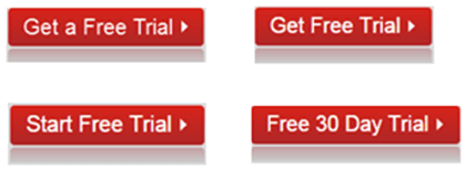
The variations were tested for 30 days, and the results were incredible!

“Variation one outperformed the original by 123%. Twice as many people were now visiting the form when we added a sense of urgency to the CTA copy and used “Start”, instead of “Get,” says Macdonald.
Once you’ve removed friction to stuff the trial funnel, improved onboarding is the next step…
#2 Better onboarding = increase in paid conversions
If you read our SaaS customer success blog then this will look familiar to you. We can’t stress enough how important onboarding is to your SaaS company’s growth.
Excellent onboarding is the key to trial conversion success.
Autopilot CMO Guy Marion explains one approach to improved onboarding “is to micro-analyze the hurdles and buying decisions faced by a user, then deliver personalized in-product, email, and direct touch points to guide a user through their journey towards “aha” or magic moments.”
Ideally your UX is intuitive and simple. If it isn’t immediately obvious to a user how to use your product and achieve the perceived value, they probably won’t want to purchase it after the trial — they likely won’t even use it during the trial.
“Be laser focused on highlighting the main benefits of your product and the features closely associated with long-term success,” advises Belle Beth Cooper, co-founder of startup Hello Code.
With this in mind, you want to identify your best onboarding content and delivery method. Initially Hubspot onboarded with long webinars, “but later found that short, three-minute videos offered better engagement.” The “bitesized” information helped “establish intuitive learning, and demonstrated precisely what customers required quickly and effortlessly.”
Within your own SaaS company you can test to determine if a live demo or pre-recorded video tutorials convert better, in addition to the best content length.
Get trialers active immediately
According to CrazyEgg, if your trial user is active within the first 3 days following signup, they are four times more likely to convert to paid following the trial.
Totango reported that only about “20% of trial subscribers are true evaluators, 70% tend to be accidental sign ups who do not engage with the trial at all, and 10% are potentials who’ve activated the trial but are not very active.”
How do you get users to become more engaged with your product after trial signup?
You need your trial user to use the product and complete mission critical tasks to see the value of the product before they will convert.
Marion lays out the following rule for trial engagement:
“As a rule of thumb, get a new user to an “aha” moment within 30 seconds of signing up, and you earn 3 more minutes of attention. Deliver another “aha” after 3 minutes to earn 30 minutes, and 30 minutes will earn you three days.”
If you want your users to convert to paid customers, you have to help them achieve their goals. Not sure what customer success looks like for your trial users? Ask them!
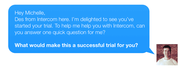
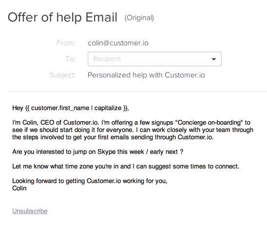
Customer.io utilized concierge onboarding to help trial users see the value of the product and in doing so doubled their conversions of free trial users to paying customers.
An email was sent to Customer.io trial users with an offer to schedule time with the CEO for a product tour:
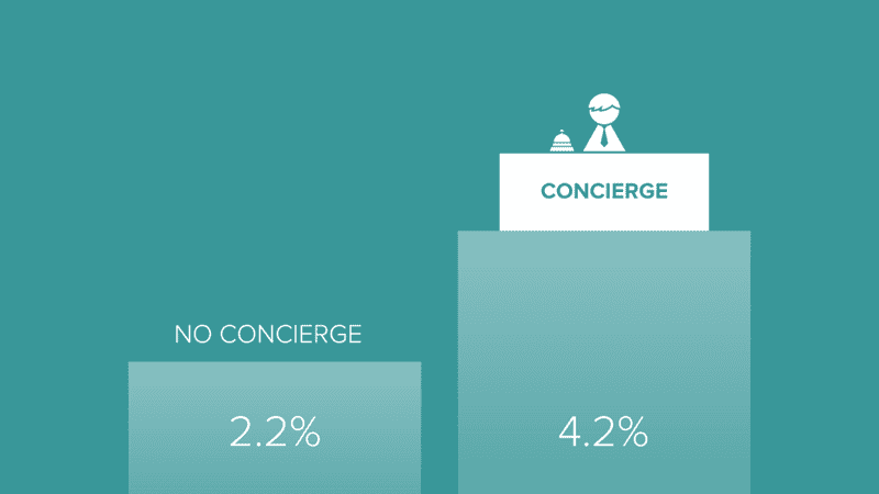
The company looked at results against a control group that didn’t receive concierge onboarding and found the following:
- 192 emails sent
- 21 replies (10.9% reply rate)
- 14 “concierge calls” (7.2% call rate)
- 8 conversions to paid (4.2% conversion rate) while the trial to paid user for the control group was only 2.2%.
But don’t stop at that initial email . . .
#3 Action based communications
“If you’re still sending emails based on a timed sequence instead of triggered by actual user behavior, you’re 100 percent doing it wrong.” – Lincoln Murphy
Gone are the days of sending emails based solely on the number of days they’ve been trial users. Heavily engaged users may be up and running within a few days while other users may not have logged in since signup. Sending all users the same email at the 3 day mark will alienate users because it is obvious you aren’t in touch with their needs and use of the product. That’s where action based (also called “behaviour based”) emails come into play.
It is important to monitor user behavior on your site and product. According to Kissmetrics, you should be asking “What exactly are they doing, how can you get them to do more of it, and how can you influence this behavior into conversions?”
Part of being able to answer those questions goes back to understanding what customer success looks like for your trial user. Intercom suggests, “For each of those definitions of success you should have a corresponding action in your product that you expect successful trialists to complete by day three.”
Why do they specify by day 3? In the onboarding section we mentioned a trial user who is active within the first 3 days of signup is four times more likely to convert to a paying customer. To assist in this you should be sending an email immediately upon signup to the user and then multiple emails throughout the trial based on actions taken within the product.
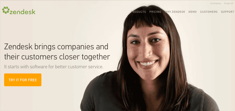
Zendesk is one of many SaaS companies who flag users based on product features they’ve used in the trial, and users receive automated emails based on those actions.
Zendesk goes one step further and has sales people call users who are heavily engaged in the first 3 days after trial sign up to offer assistance and follow-up. The combination of sending behaviour based automated emails to all trialers, and phone calls to heavily engaged users has increased trial to paid conversion by over 30%.
Behaviour based emails are also essential to re-engage at-risk trial accounts. By using products like Intercom you can identify users that seem to be stuck and proactively reach out to offer assistance, either via email or in-app messages. Doing so keeps the trial user moving forward in the onboarding process, helps them see the value in your product, and increases the user’s trust in your SaaS company.
Customer.io’s diagram below indicates points at which action-based emails can be sent to keep trial users engaged:
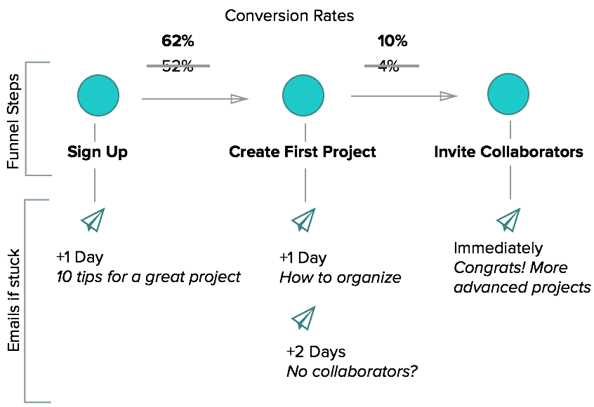
You can use a tool like Kissmetrics Funnel Report to see which customer segments convert. Once you have defined what a successful trial experience looks like, use action based communication to nudge user down the right path. For converting customers it is essential that you . . .
#4 Make the upgrade workflow easy
It seems intuitive but needs to be said: When the time comes for the the trial user to upgrade to a paid plan please make it easy for them to do so.
Frequently “tips to improve conversions” will focus on having a clear call to action (CTA). We’ve already discussed the CTA importance, but a simple upgrade path goes beyond a clear CTA button or copy.
Neil Patel weighs in: “By the way, if the customer has to ask how to buy the product or activate a new account, you’re doing it wrong. The process should be childishly simple.”
Notice in the end of trial/upgrade email from Front, below, the pricing plans are easy to understand, but the directions to upgrade, “simply go to Front and click Settings > Billings > Choose plan” may seem complicated or overwhelming to the user.
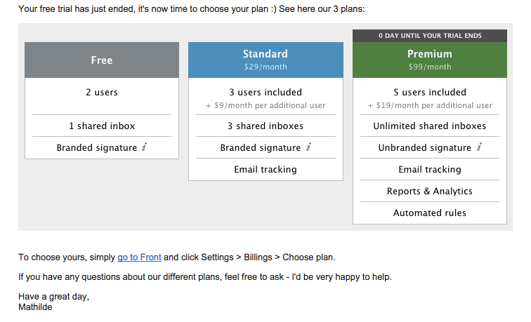
In comparison, Squarespace’s end of trial email offers both an automatic trial extension and an easy “Upgrade Now” button, which is a more intuitive upgrade path compared to Front’s.

Another suggested improvement to make the upgrade path easy (and nudge the user towards a conversion) is to include a prominent in-app “Upgrade” CTA during the trial period. The example below is from Appcues‘ trial workflow.

I’ve seen companies go as far as putting a trial expiration countdown in the header, such as “Your trial ends in 4 days. Upgrade Now” to build urgency and provide a clear upgrade path.
Once a user begins the upgrade journey, your pricing page should differentiate pricing, be easy to digest, and include the features in each plan:
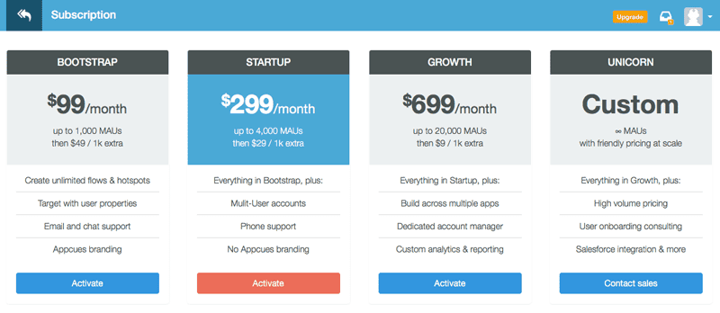
In short, eliminate unnecessary friction during the upgrade process. The upgrade path should be no more than one or two clicks away and your plans should be easy to understand and select.
#5 End of trial feedback
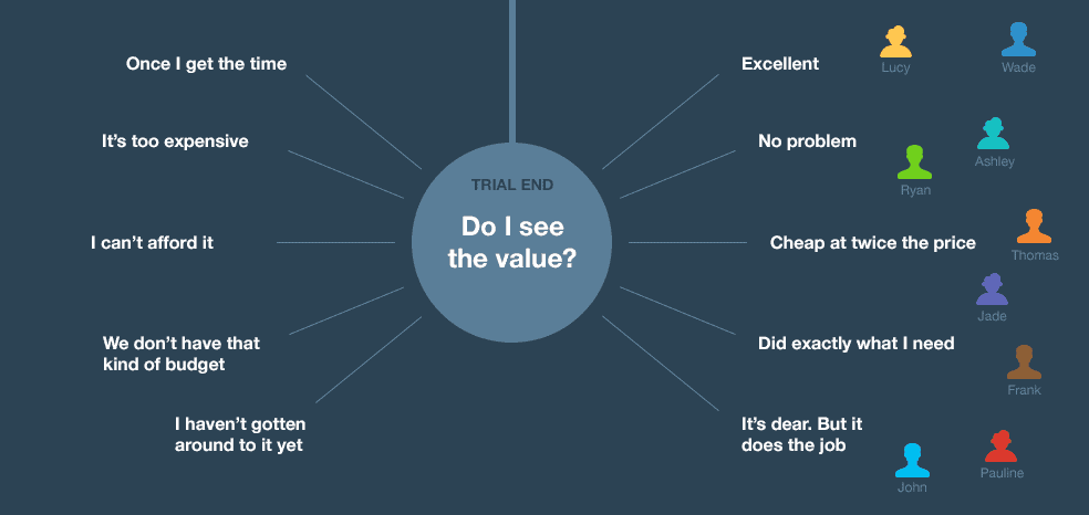
It is good to understand why users converted from trial to paying customers, but often you’ll learn even more from those who have not converted yet.
Trackio created an in-app offer for a free, 3 day trial extension to any user who didn’t convert to a paid plan by the end of the trial. In exchange, they requested feedback as to why they weren’t ready to purchase.
Notice (below) they don’t ask a general question on what the user did or didn’t like about the product. They’re specifically asking why they weren’t ready to start paying for a subscription.

Feedback from trialers who hadn’t purchased not only gave them the opportunity to reach out and offer resolution to the user, it also helped shape Trackio’s product roadmap. Trackio shared some real examples of user feedback and changes they made as a result:
- “I’m worried about how the pricing is based on # of users and not # of active users. Can you explain please?”– We updated our pricing to use ‘Active Users’. The user became a paying customer
- “We can only pay by invoice”– We added invoice payments on Enterprise plans
- “I couldn’t understand how funnels worked”– We got this one a lot. We walked the users through our funnels product. After many realised it didn’t suit their needs, we decided we needed to re-assess the funnel report and how it fitted into our overall product
One of the best lessons from the feedback was that “product usage didn’t always correlate into product engagement.” Co-founder and CEO Liam Gooding explains:
“What was particularly interesting was all the feedback we received about using our 2 main data reports: Metrics and Funnels.
We actually learned just how many users really didn’t understand them very well, and it allowed us to dig much deeper into those users’ usage data. On the surface, they’d used the features perfectly. However, it wasn’t until we dug into conversations that we realized they’d only been testing the surface, but hadn’t managed to see the obvious ROI on them.”
Trackio’s implementation of the automatic trial extension offer increased paid conversions by 33%!
At Maxio, we offer a hybrid free trial. You can sign up for a free test account and then upgrade when you are ready to start accepting real transactions. If a user is still on the free plan after 30 days, we send the following email:
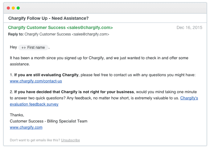
Option two in the email is our feedback loop for users that decided Maxio was not right for them. We have a short survey where we simply ask “What reasons prevented you from implementing Maxio?” and “What could we do better?”
In some cases, users say we lacked a feature that we actually have, and we get a chance to re-engage and reel them back in. In other cases, we get real world feedback that helps us improve our user onboarding, refine our product roadmap, and make the trial experience more successful for future users.
If your company is not getting feedback from users that do not convert, you are missing out!
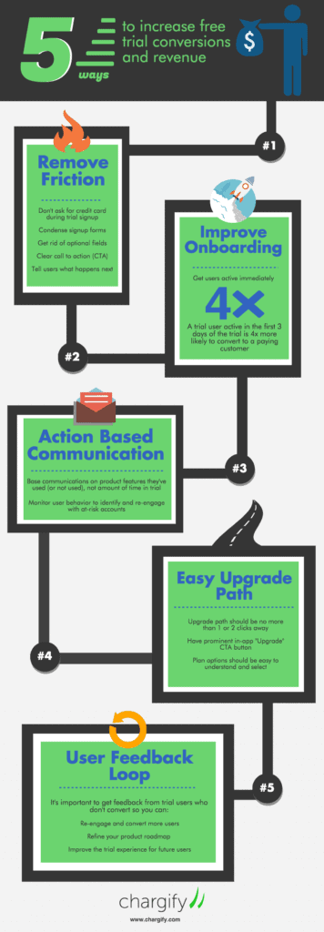
Let’s review (with an infographic)…
Of course, once you’ve converted trial users to paying customers it doesn’t stop there! For recurring revenue businesses the majority of revenue occurs after the initial sale, and it can be difficult to replace revenue lost through churn by gaining new customers. Once you’ve used the top 5 ways to increase your SaaS free trial conversions, you’ll want to make sure you have a solid customer success plan to retain those converted customers!

